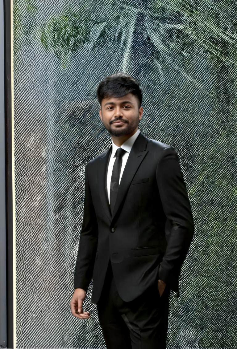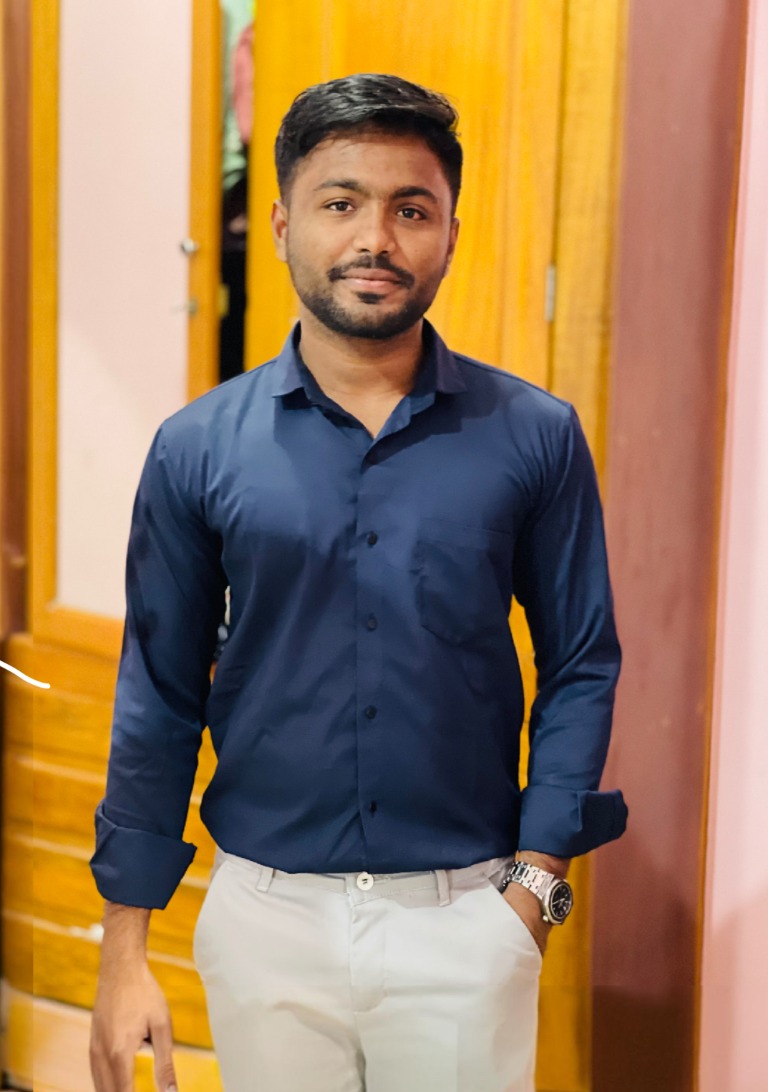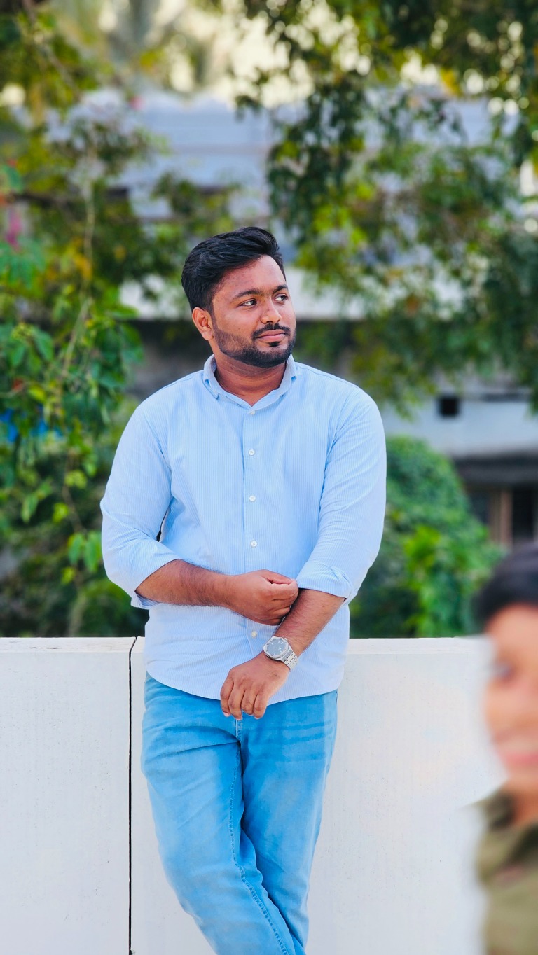
HELLO, I’M A PRODUCT DESIGNER / NO-CODE DEVELOPER

Designer’s eye.
Builder’s mindset.

Turning complex problems into intuitive digital experiences. Blending product design, AI, no-code and development to bring ideas to life.

Freelance
05 / FREELANCE · CLIENT PROJECTS

Built for real clients, end to end.

Independent website and e-commerce projects for clients, from understanding the business to a launched, responsive experience.

Diagrams are illustrative. Client details are kept private.
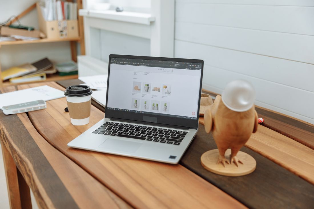
A laptop on a wooden desk showing an online store website, beside a coffee cup
Photo: Pexels
INDUSTRY
Business websites · E-commerce
CONTEXT
Independent · 2022 to 2024
MY ROLE
Website & e-commerce designer
SCOPE
Client websites and stores, from discovery to launch
THE CHALLENGE

Small businesses need a site or store that reflects what they do, but rarely have a clear brief, ready content or a design team.

WHAT I DESIGNED

Client websites and e-commerce stores, taken from understanding the business to a launched, responsive experience.

KEY SOLUTIONS
  • A discovery step that turns a business into a sitemap
  • Pages built around one primary action
  • Sites the client can update after launch
01 / OVERVIEW

Freelance

Between 2022 and 2024 I worked independently with clients on business websites and e-commerce stores.

Every project started with understanding the business, then moved through structure, design and build. Client details are private, so this case shares the process I rely on.

What I executed

  • Client requirements gathering
  • Content inventory and sitemap
  • Responsive website layouts
  • E-commerce layouts
  • Build in Webflow and Shopify
  • Handover so clients can manage content
02 / CHALLENGES

What needed to change

Visitor challenges

  1. I can’t tell what this business offers
  2. I can’t find how to contact or buy
  3. The site is hard to use on my phone
  4. I am not sure I can trust it

Client challenges

  1. No clear brief, and content not ready
  2. A tight budget and timeline
  3. Worry about being unable to edit the site later
  4. A need for enquiries or sales, not just a good look
03 / RESEARCH

What I discovered

Client projects do not come with a research budget, so I made discovery lightweight and repeatable. The aim is to learn enough about the business, the audience and the content to make confident decisions.

Research methods

  • Client requirements gathering
  • Audience and competitor review
  • Content inventory
  • Sitemap and page-goal planning
Key findingWhat it meant for the design

Content is usually the biggest bottleneck. Waiting for it until after design causes delays and weak pages.

I collect content early and design with real copy, so the layout fits what the business actually says.

Clients are not sure what they need until they see their business laid out as pages and goals.

I turn discovery into a one-page brief and a sitemap the client approves before any visual design.

Sites decay when the owner is afraid to touch them after launch.

I structure the CMS around what the client will really update, and hand it over in a way they can use.

04 / PROCESS

From insight to interface

The same flow runs on every project, scaled to the size of the business. It keeps decisions in the right order and keeps the client involved at each checkpoint.

  1. 01Discover
  2. 02Define
  3. 03Sitemap
  4. 04Wireframes
  5. 05UI design
  6. 06Build
  7. 07Launch
  8. 08Handover
  • Business first, template second

    The site is shaped by what the business needs to achieve, not by a ready-made layout.

  • One page, one job

    Each page has a single main action and is designed around it.

  • Real content early

    Design with real copy and images so decisions hold up at launch.

  • Hand over, don’t hold on

    The client should be able to run the site without me.

05 / HOW I SOLVED IT

Decisions, and what they cost

Every strong decision gives something up. These are the calls that shaped the experience, and the trade-offs I accepted.

01

Start with the business, not the template

Solves: Unclear briefs and unfocused sites

Discovery becomes a short brief and a sitemap. The client sees their business laid out as pages and goals, and confirms it before any visual work begins.

Trade-offIt takes time before anything looks designed, but it prevents expensive rework later.

Illustrative diagram: sitemap
02

Design each page around one primary action

Solves: Visitors who cannot tell what to do next

A clear headline, a single call to action and supporting sections in a predictable order. The same structure works on mobile and desktop.

Trade-offLess room for secondary content, which moves to supporting pages.

Illustrative wireframe: landing page
03

Build it so the client can run it

Solves: Fear of editing the site after launch

Content is organised into simple fields and collections that match what the client actually updates, so changes do not need a designer or developer.

Trade-offA tighter content model limits one-off layouts, but protects the design over time.

Illustrative wireframe: content editor
06 / READY FOR DEVELOPMENT

Built to stay consistent

A small, reusable set of sections lets me build faster and keep every client site consistent and easy to maintain.

  1. FoundationsBrand colour, type scale and spacing, adapted per client
  2. ComponentsButtons, forms, cards, navigation, product and service blocks
  3. SectionsHero, services, proof, pricing, FAQ, contact
  4. TemplatesHome, service, collection, product and content pages

Developer handoff

  • Responsive layouts for mobile, tablet and desktop
  • Webflow and Shopify builds with a clear content structure
  • A handover so the client can edit content independently

Responsive across devices

Every site is checked at phone, tablet and desktop widths before launch, with the main action visible without scrolling.

States designed, not assumed

  • Form success
  • Form error
  • Out of stock
  • Empty results
  • Loading
  • 404
  • Mobile menu
07 / IMPACT

How success is measured

I have not published outcome numbers here. These are the measures the design was built to move, and the ones I would track.

  • Enquiries or orders per month

    The outcome the client actually cares about.

  • Clicks on the primary action

    Shows whether pages are doing their one job.

  • Edits the client makes without help

    A direct signal that the handover worked.

  • Mobile usability issues after launch

    A check on responsive quality in the real world.

08 / REFLECTION

What did I learn?

  • A clear brief decides quality

    The better the discovery, the fewer revisions and the stronger the result.

  • Constraints are a design tool

    Small budgets and timelines pushed me towards simple structures that worked.

  • Handover is part of the design

    A site the client cannot update is unfinished, however good it looks on launch day.

What nextNext I would standardise a discovery kit and a section library so each project starts faster, with the same quality bar.

MORE PROJECTS

Continue exploring.